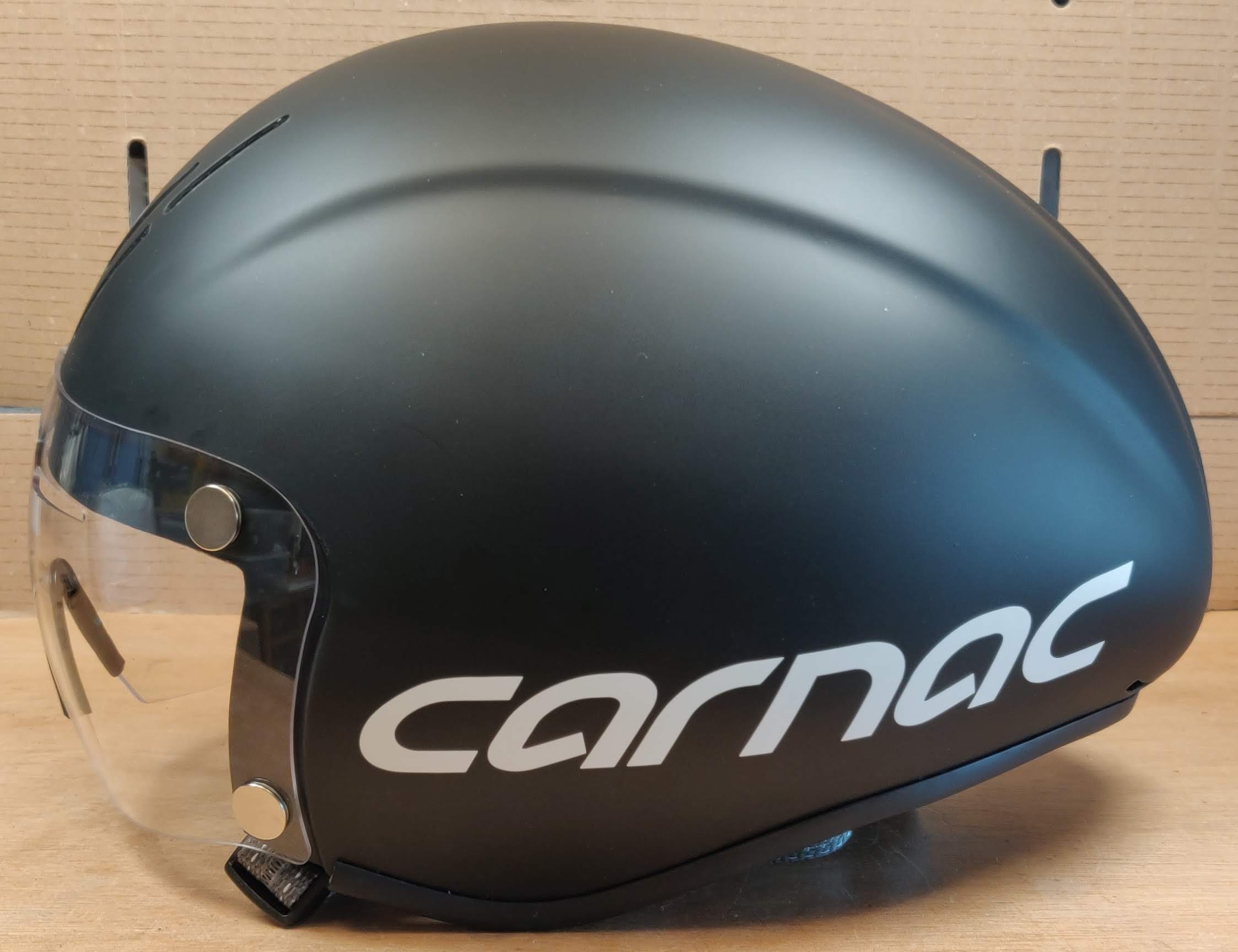
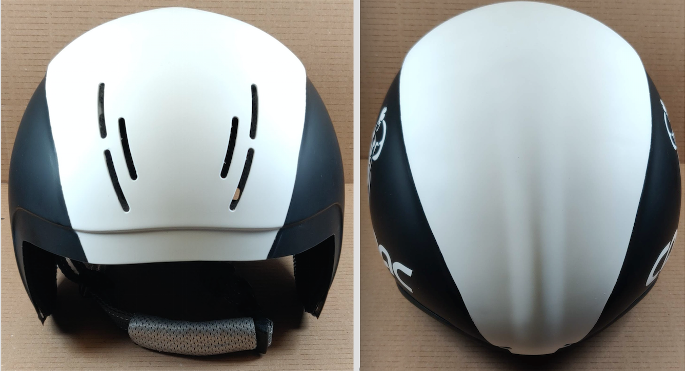
So, I currently find myself unable to cycle for a few weeks. I decided it would be nice to do some airbrush work. Nice light duty while I recuperate from RARP. I couldn’t think of a target, so picked something cycling related and useful, that I wanted anyway – a Carnac Kronus tt helmet. £40 from PlanetX. I don’t know how much impact it would have on my tt times, but they say it makes a difference. For now, let’s try to make it look nice and have some fun and maybe learn something in the process.
My initial thoughts were to paint the middle section (the raised part) fluorescent yellow. I tend to do that with all my helmets. So I started by masking off parts of it and flatting that central raised section with 800 grit wet ‘n’ dry. I also sanded off the logo from the front, otherwise it would show through as an embossed image.
Having done that it was time to mask it all up and spray on a couple of coats of white primer. Whenever spraying over something dark, a white primer is a good idea or you’d need a large number of coats of colour and it would still not get quite the right effect.
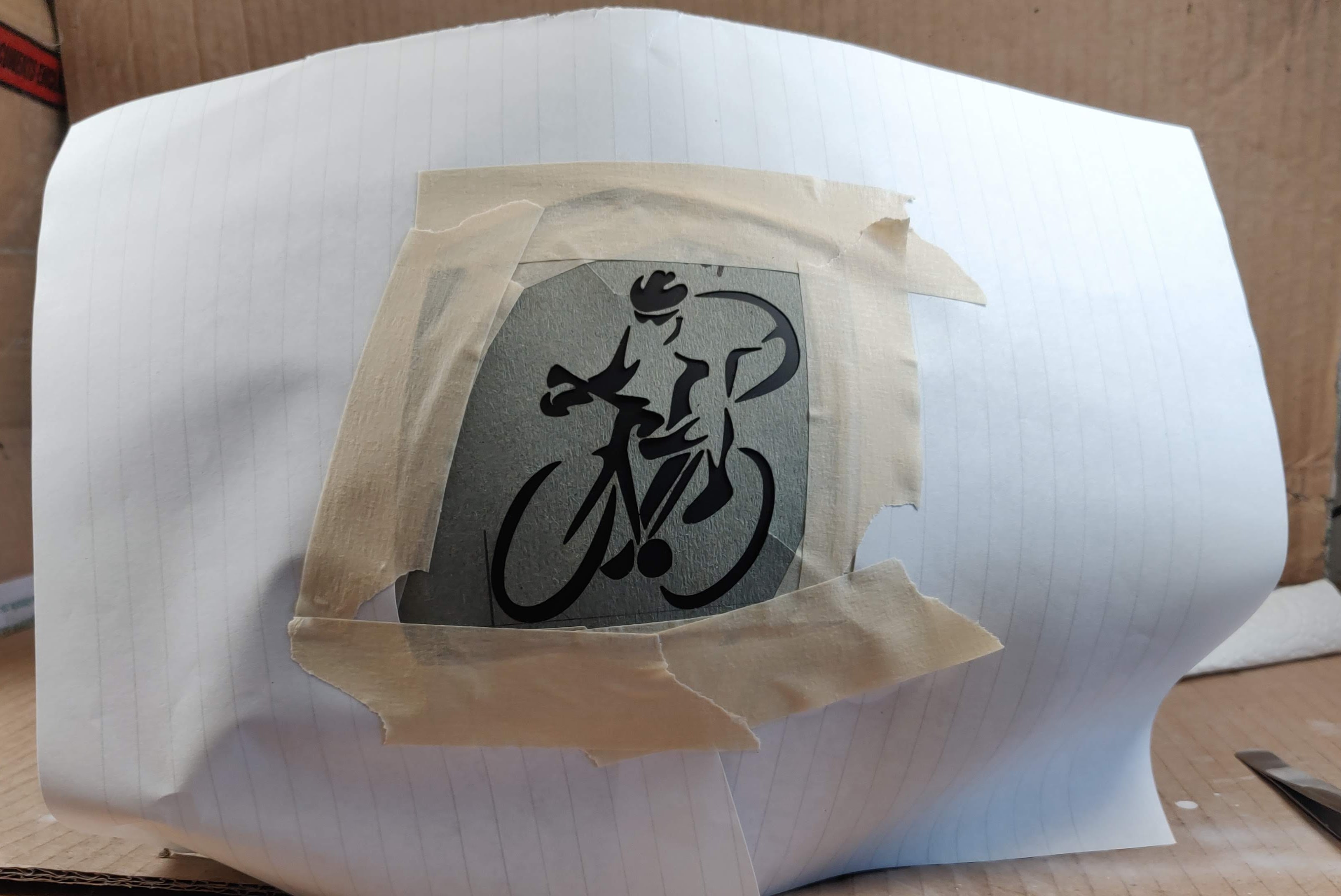
Then it was time to think about the sides. I wanted some sort of graphic or artwork on the side. Singularly lacking in drawing ability, I took to the internet to find some sort of cartoon icon/graphic of a bike or bike with rider that might lend itself well to stencilling. I found something I thought might work and tweaked it so I could laser cut the stencil. Having cut it in ‘suspension file cardboard’ I was now at this point…
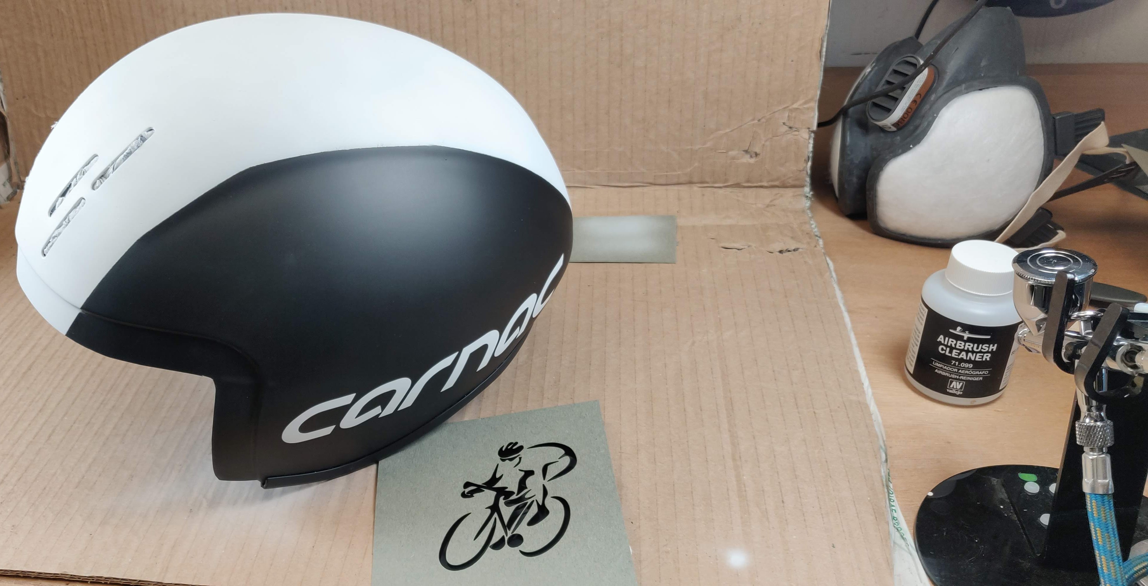
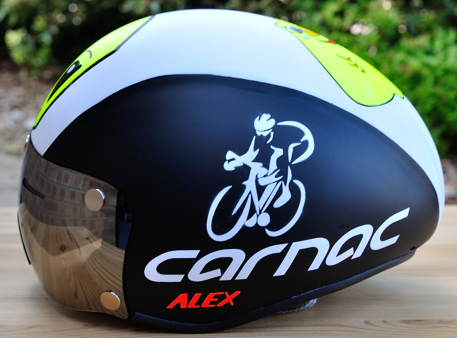
The idea here is to line up the wheels with the “carnac” text as if it’s the road. I quite like the minimalist style of the graphic and it lends itself very well to stencilling as there are no bridges required. To be sure the concept would work, I made a mock-up of the sprayed image on black cardboard (the helmet visor box was perfect for this).
I was happy that this was going to work, but I was also having second thoughts about the fluoro yellow. The white primer looked pretty good and my Roubaix is black and white, so I decided to put a few coats of white top-coat on instead of fluoro yellow. So it was remask it all, spray 3 coats of top-coat and then after waiting overnight, 3 further coats of clear satin varnish, both to seal it in and to “save” that layer of work in case I do anything over the top that then needs to be reworked.
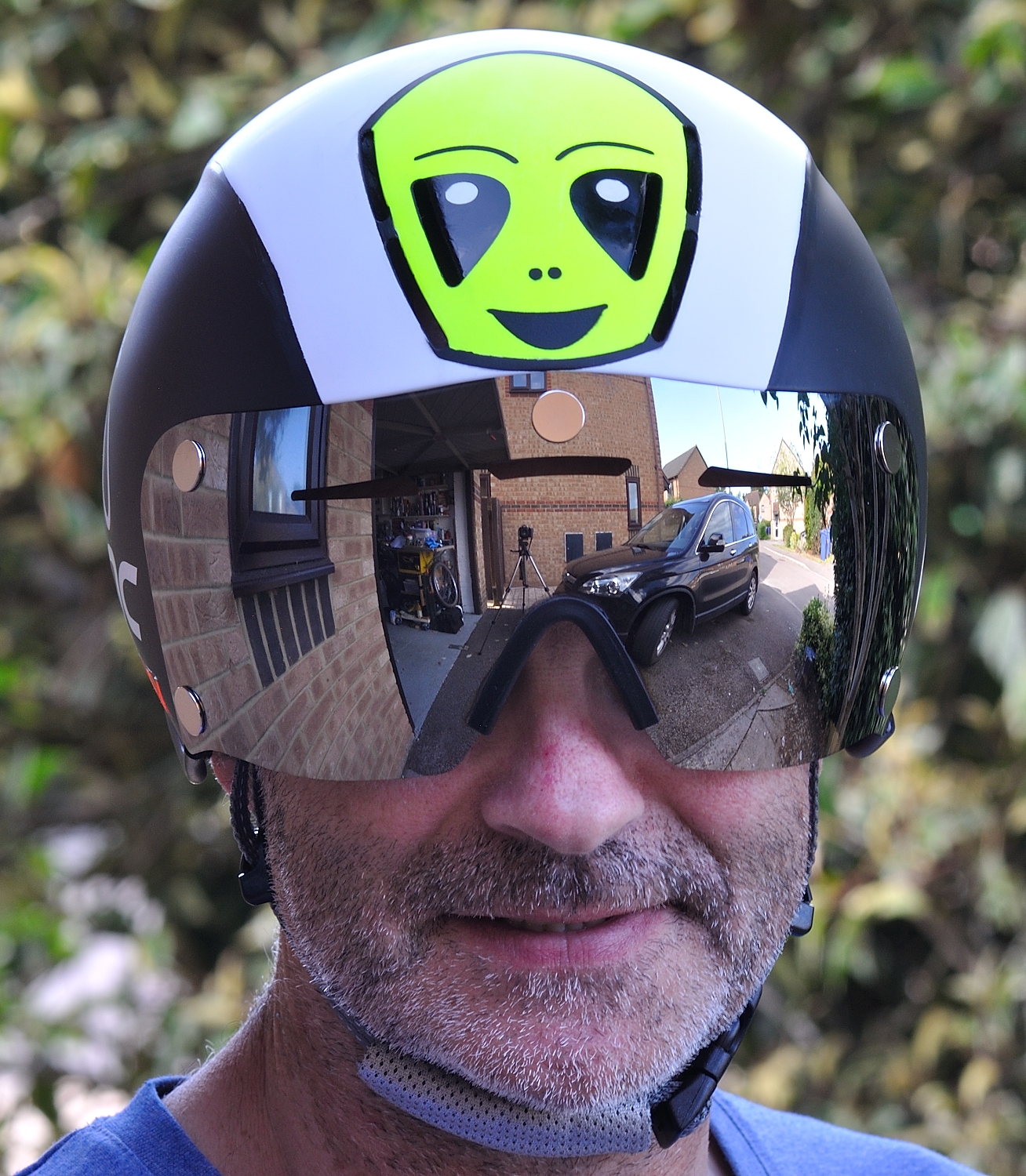
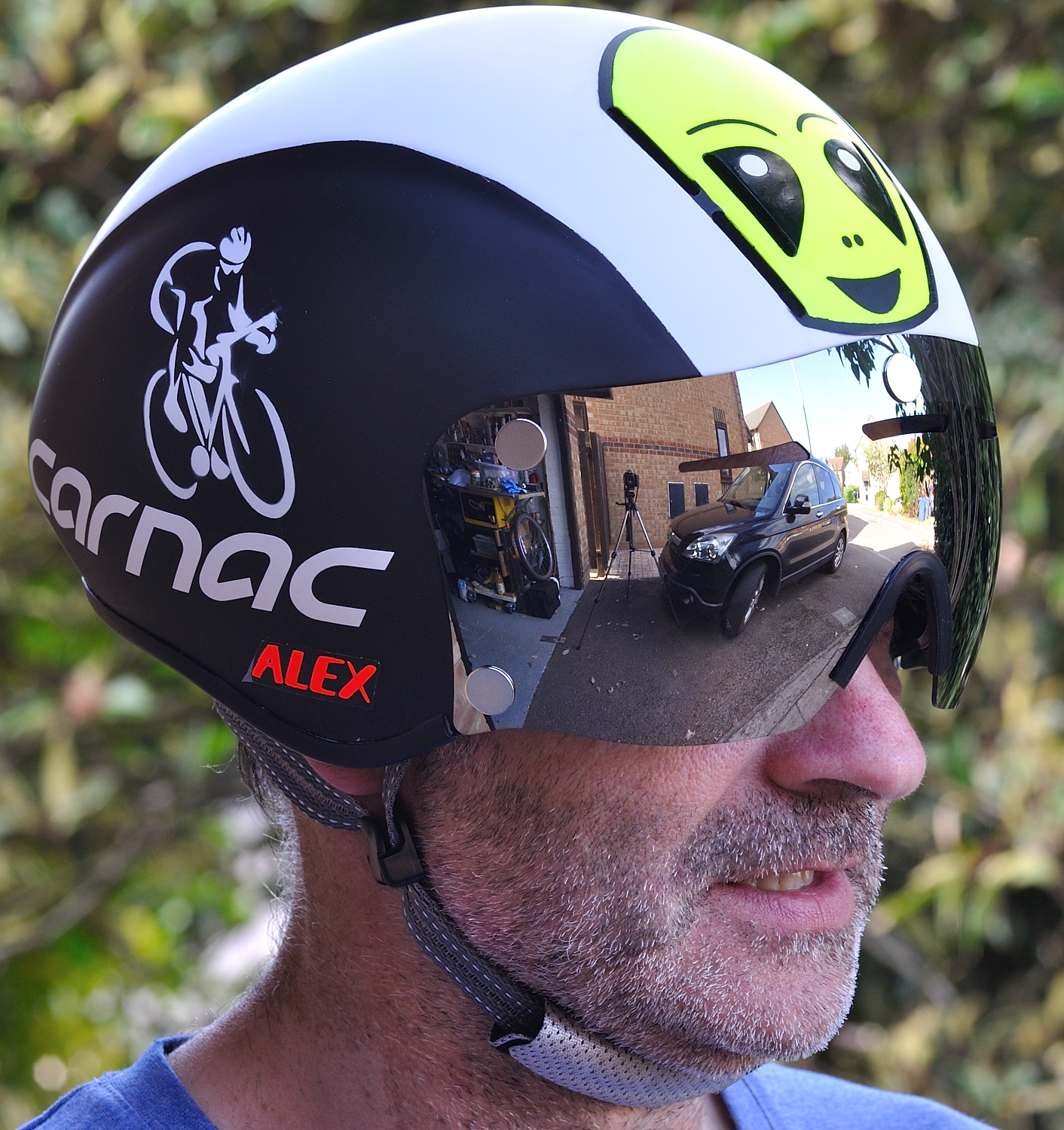
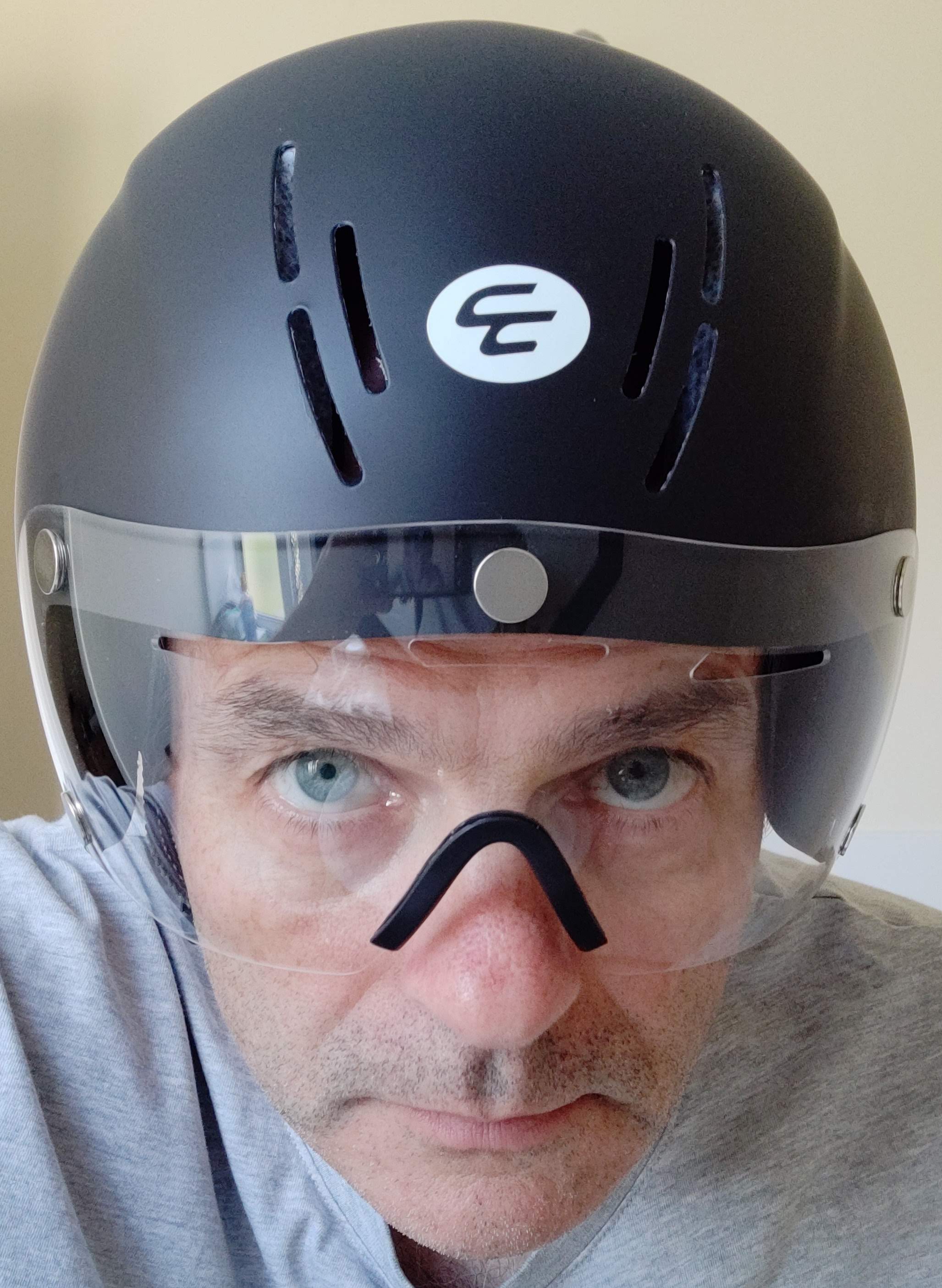
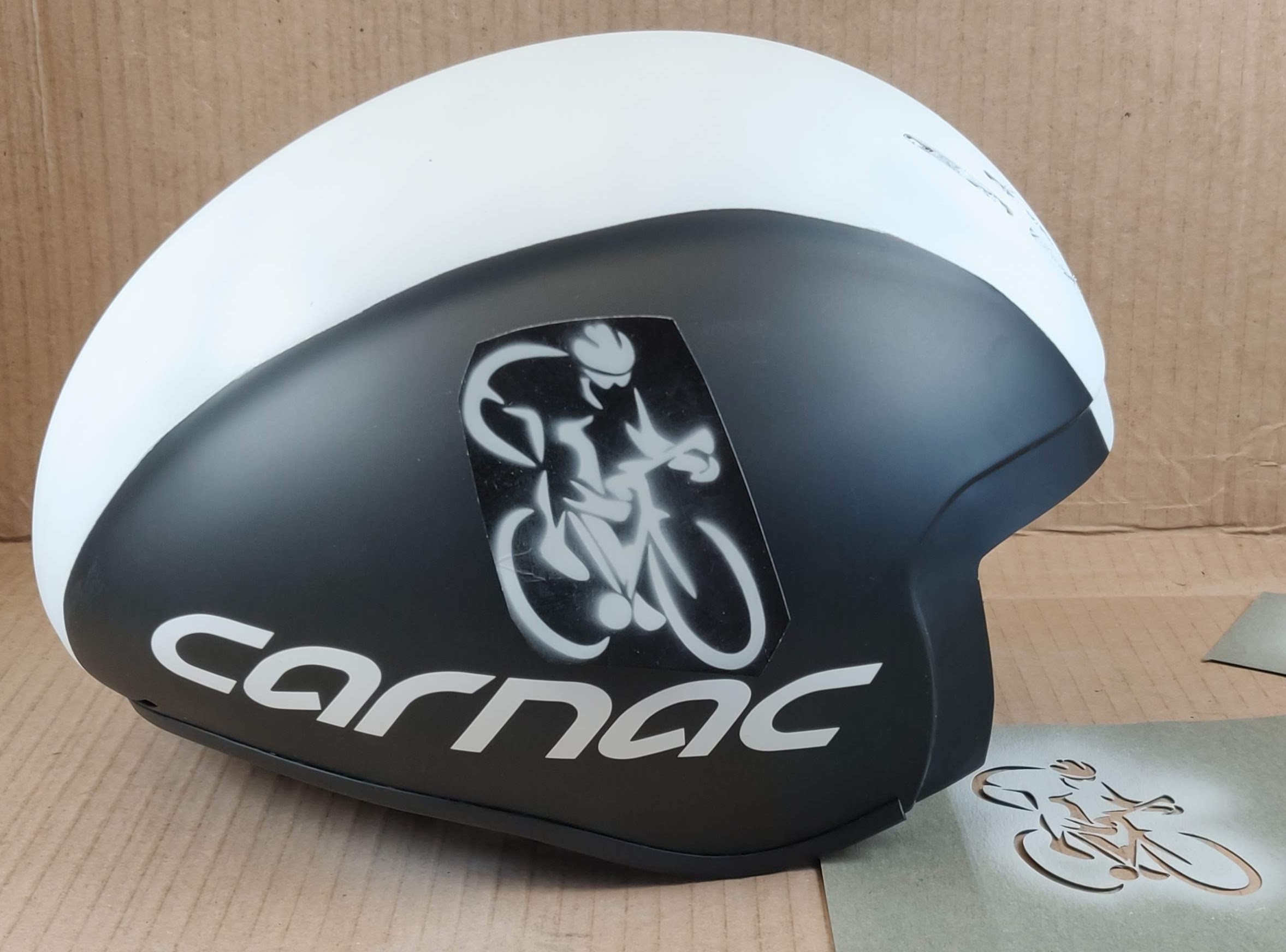
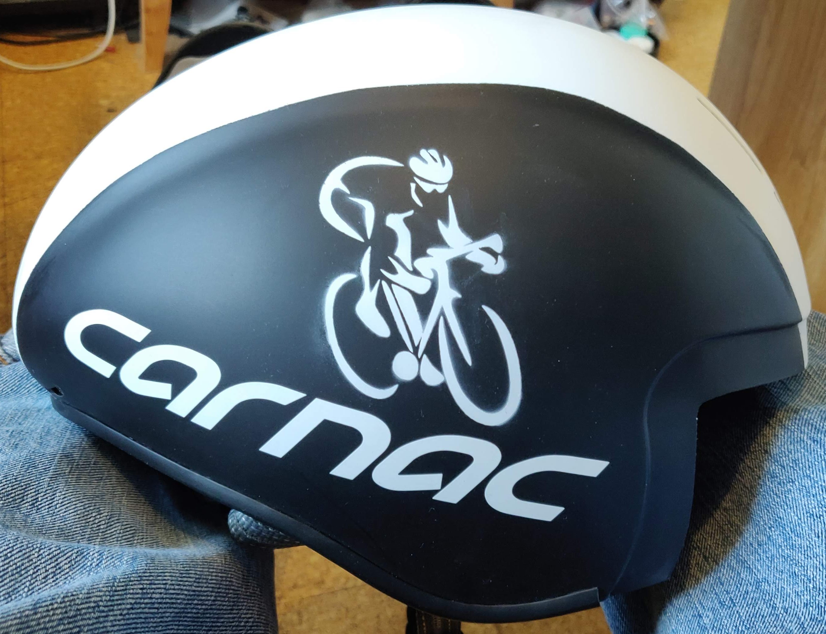
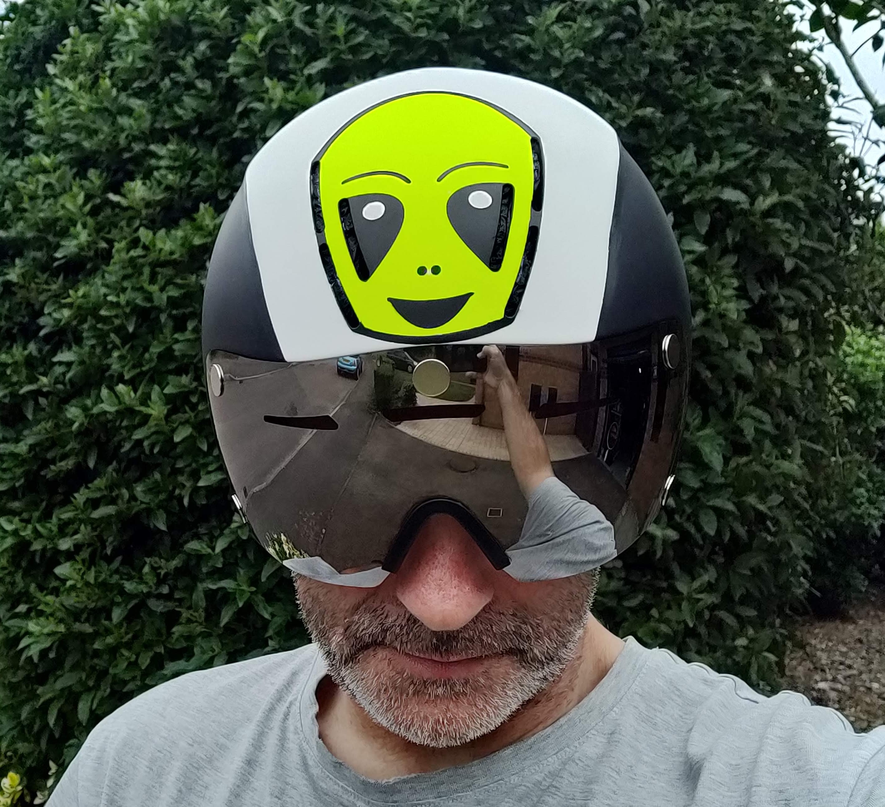
Before committing to the logo, I wanted a final sanity check, so taped a logo on each side to see what it looked like. Obviously I needed to wear it, with the mirrored visor and take a selfie outside to see what it might look like…
Yeah. That’ll look quite good, methinks! So let’s get on with the graphics. Stencils-away. It turns out that putting a flat stencil onto a compound curve is “interesting”. I had to slit it in a couple of places to make it lay flatter. Used 3M repositionable spray mount adhesive. Bloody expensive, but it’s about the best there is for this job. Then masked around the stencil to avoid overspray.
Sealed the stencil with satin varnish, then a couple of coats of white primer, followed by 3 coats of white. Which takes us to this point…
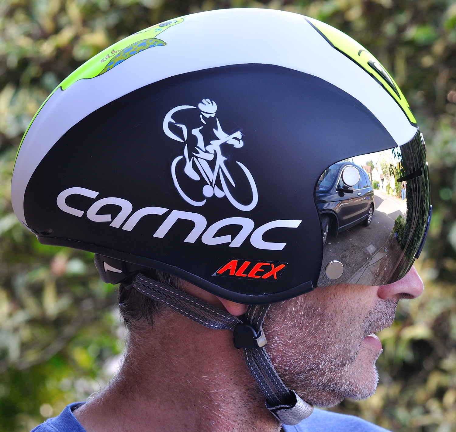
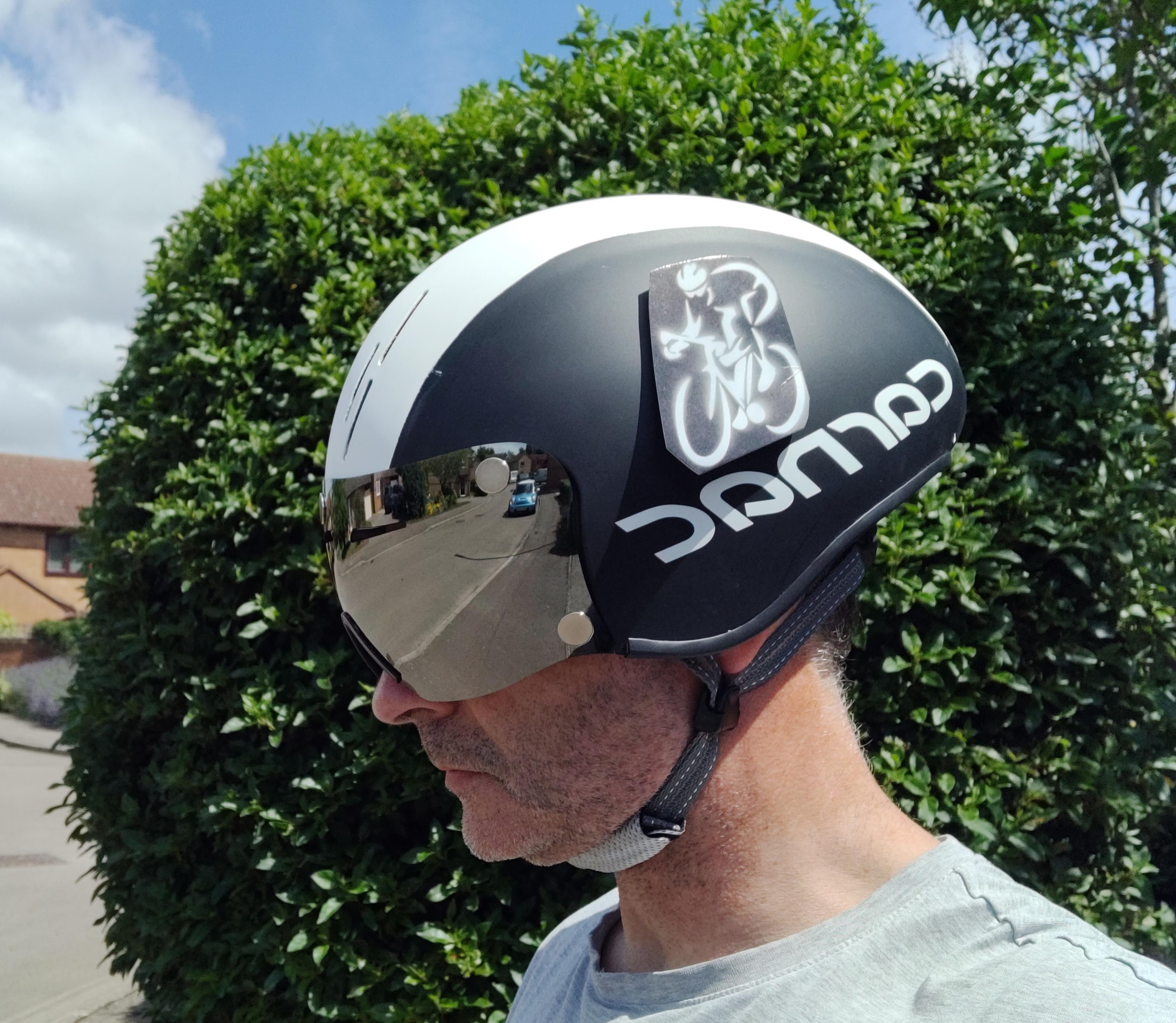
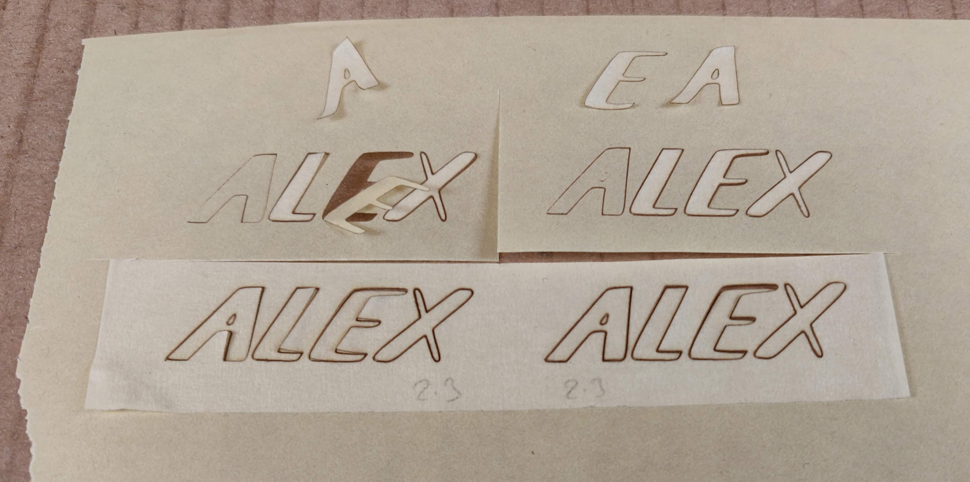
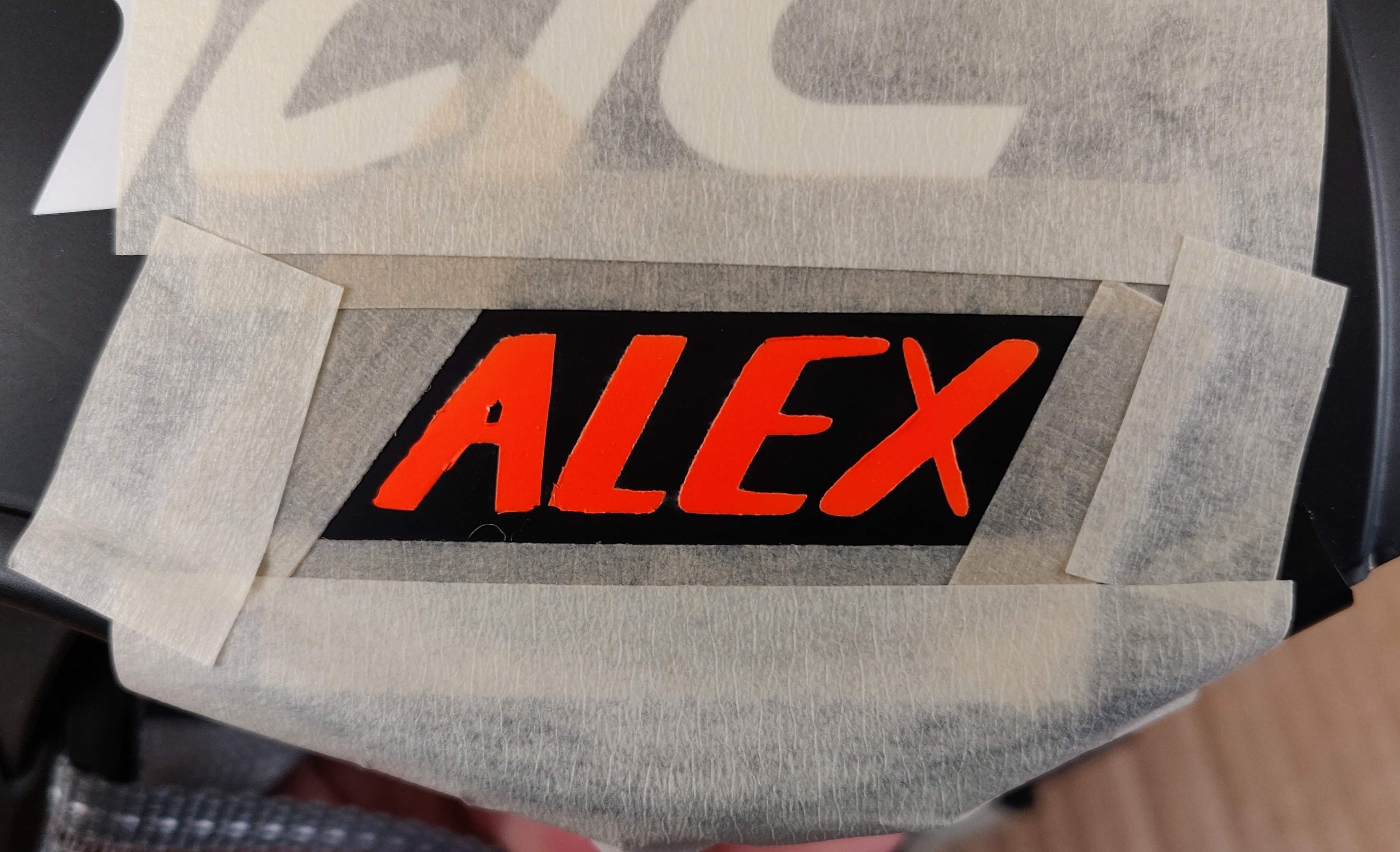
So that’s what it looks like on each side (mirrored on the other side so both riders are riding the same way I will be). The sides still need my name on the ‘ear-flap’ part below the ‘ac’ of the ‘carnac’ lettering. For sheer simplicity, inertia, lack of imagination, laziness and consistency, I decided to use the same lettering (modelled on the SPECIALIZED font) I use on my bike and other helmets for this. So I cut some new stencils on the laser cutter using masking tape.
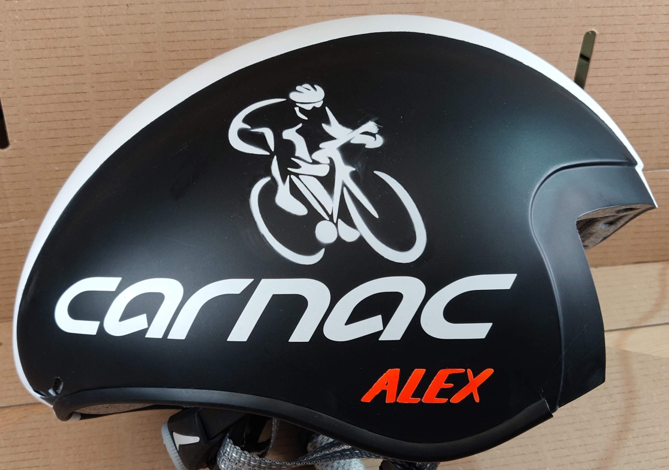
Then sealed with clear satin varnish, primed with white primer and top-coated with fluoro orange, to end up with this…
Still need to seal the name down with a border of clear satin varnish or it will peel.
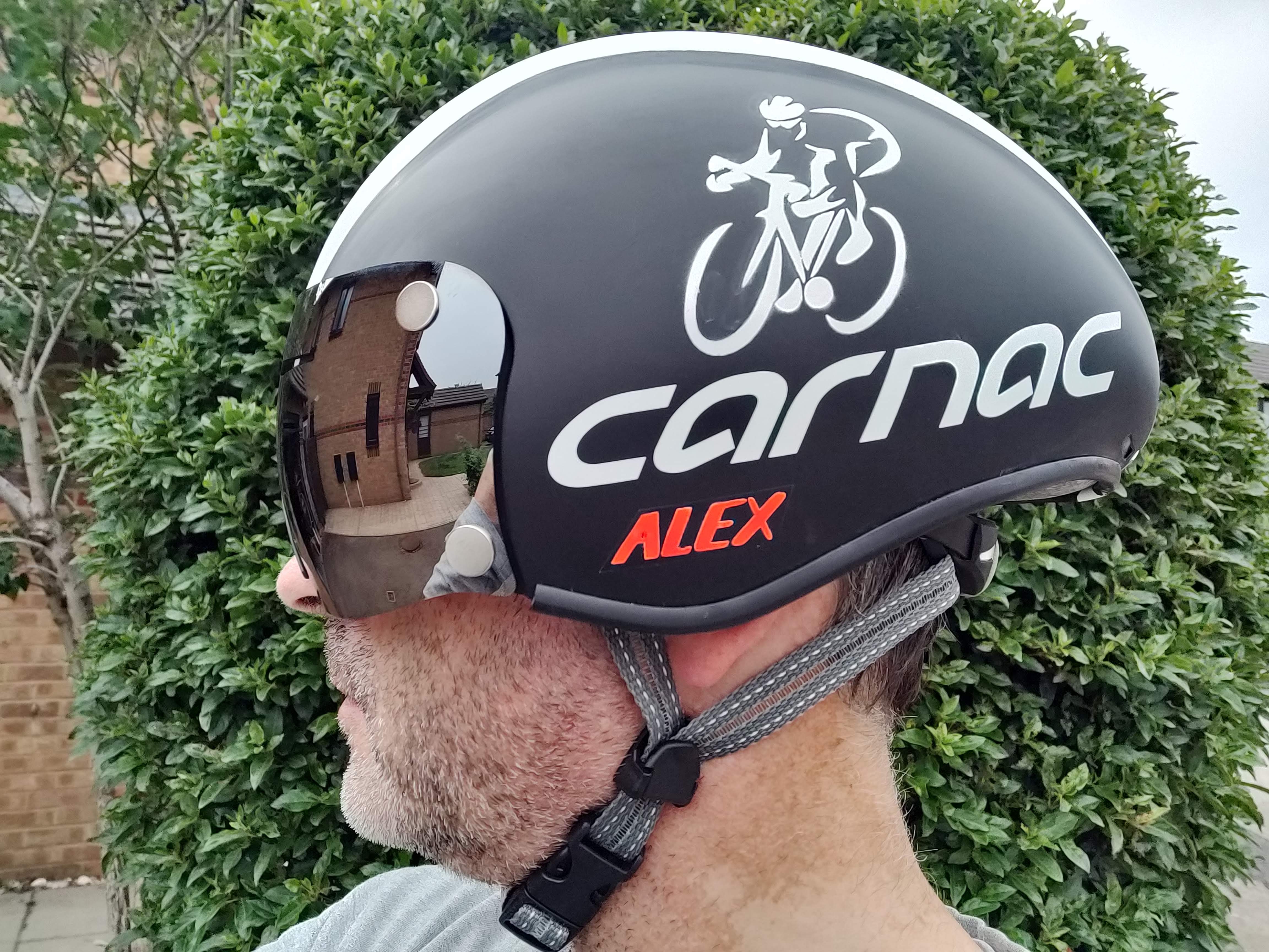
So, we’ve got the large central white band, the bike and rider graphic riding along the Carnac lettering and a fluorescent orange name. That would probably do. And yet…
…I’m thinking I’ve got this huge piece of white real-estate in the middle that might need some more tweakage. Some shapes/stripes/graphics or something else to embellish it further. Maybe the club logo? Or even a pair of eyes? We’ll see. I’m going to pause it there until the next decent idea arrives.
After the Pause
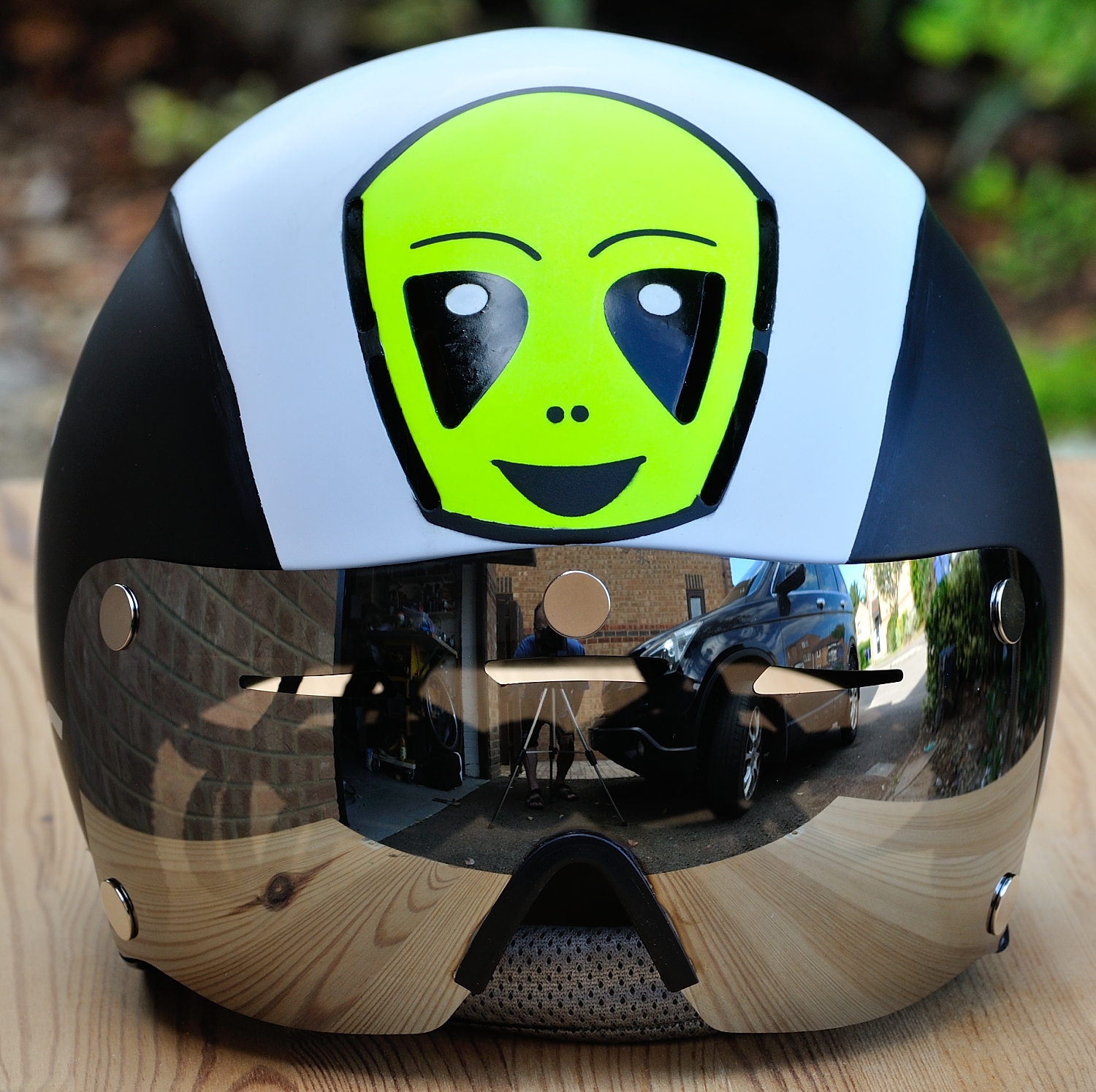
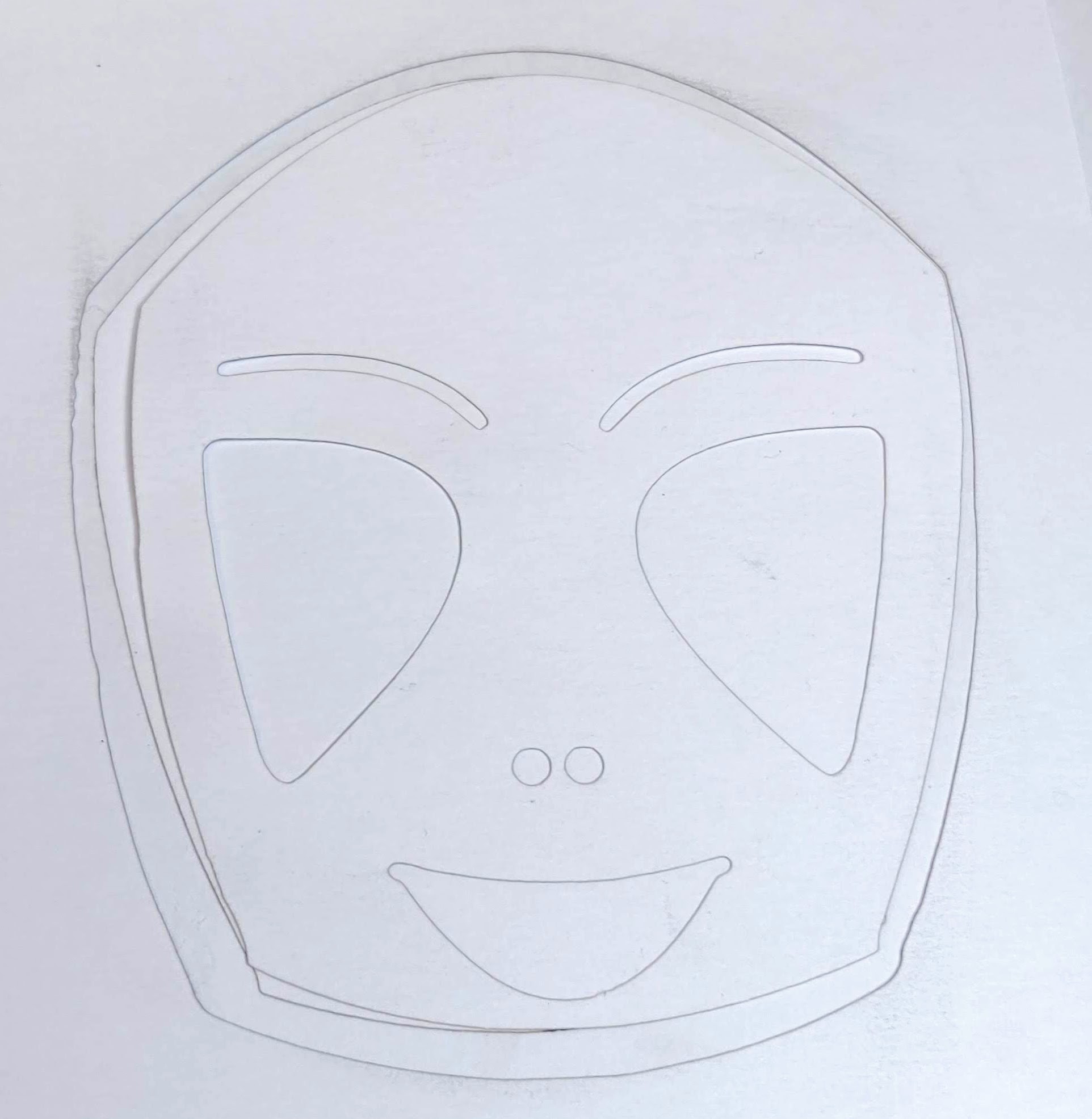
So I was thinking about some kind of cartoon character for the front. Maybe Donald Duck riding a bike or something like that? Unfortunately, I took a look at the front and we’ve got those 6 air vent lines which will look like black lines. So I decided to try and make a cartoon character of my own that would incorporate those 6 lines. All I could see in my head was a cartoon alien, so I looked up a few for reference, then printed out a photo of the helmet and started drawing on it. Drawing is one thing I freely admit I’m not very good at.
The outer vent lines help define the sides of the face and the inner ones define the outside edges of the eyes. Funny shaped eyes, but then it is an alien afterall. So after that, I had these ‘drawings’…
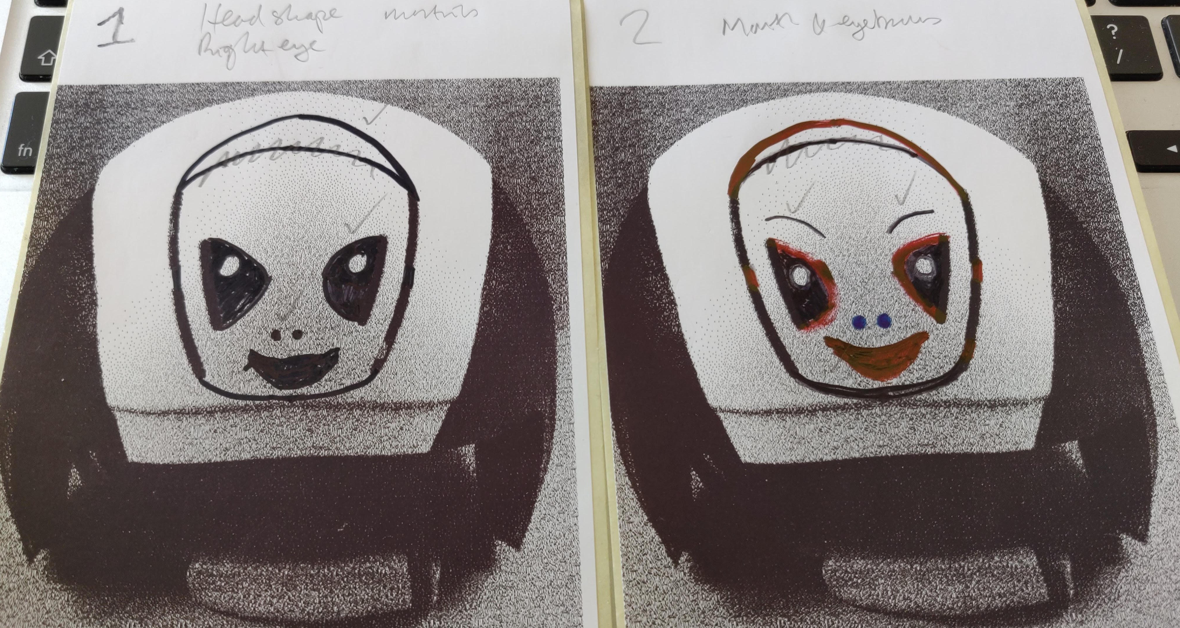
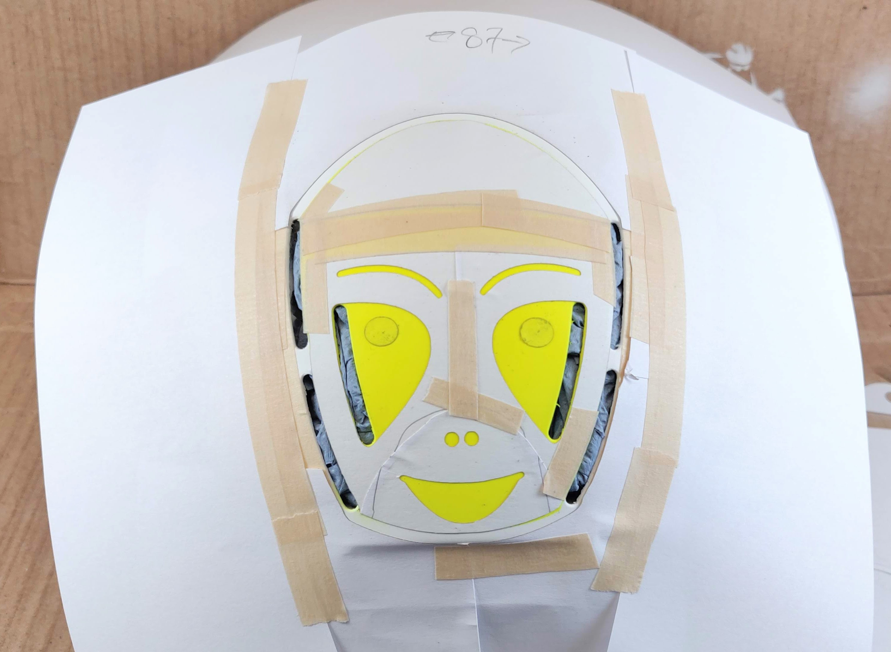
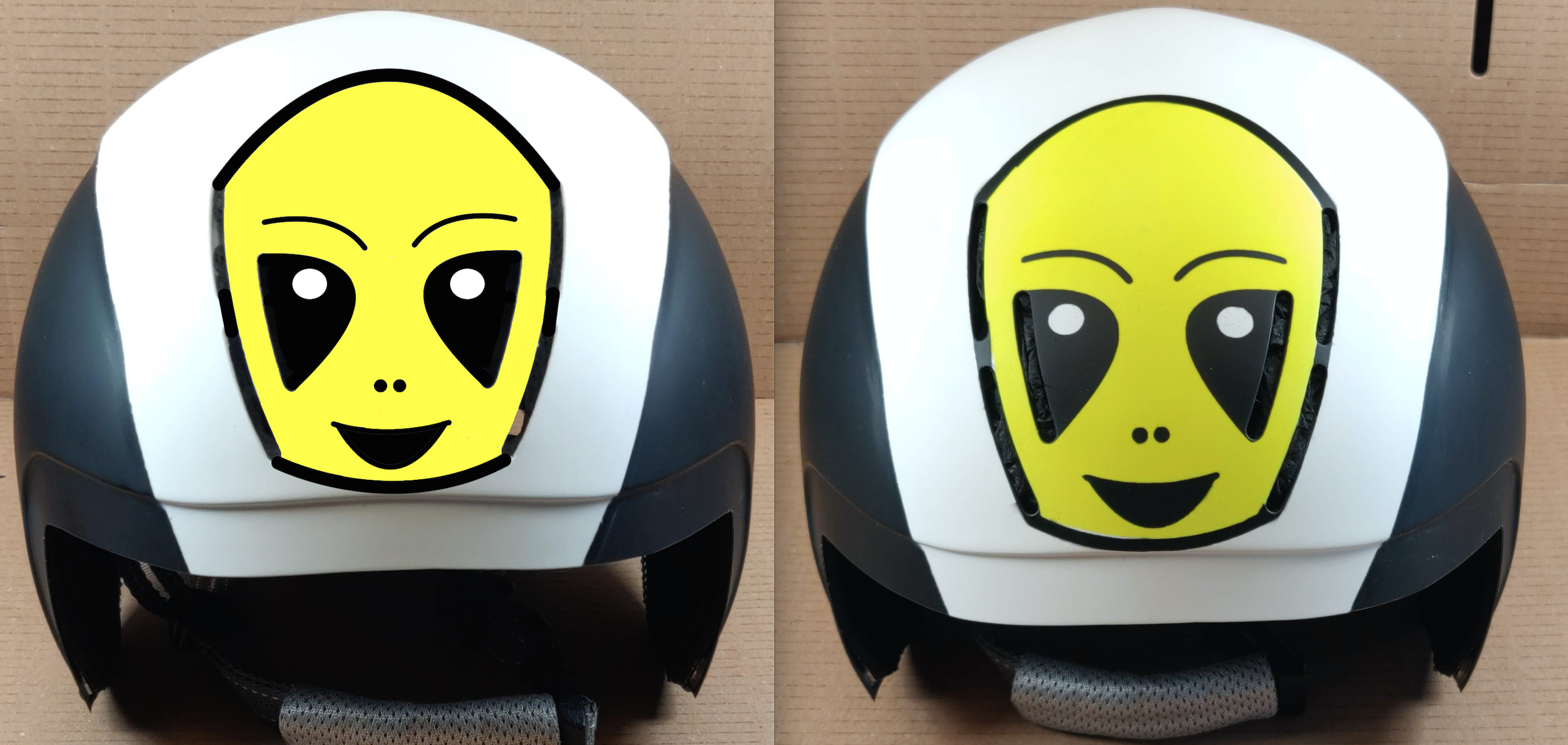
So, having a basic idea allowed me to attack the problem on the computer, which gives me some tools to overcome my lack of drawing ability. (And would be needed for stencil cutting anyway.) Creating this alien took pretty much a morning piddling about with photoshop and inkscape, but it seems to camouflage the air vents really well.
On the computer, it looks pretty good. Now it was time to cut stencils on the laser cutter. I used paper this time as the compound curve issue is a bit less of a problem with a thinner medium. Still had to snip it a bit in places though.
Scaling is a Challenge
The distorted perspective of a working with an angled photograph of a compound curve (whilst designing in 2d) meant that it was a bit of a challenge to get the scale and dimensions exactly right. I scaled it for width, which meant that the height wasn’t exactly right. But with a bit of judicious snipping, the stencil was made to fit. The immovable objects, obviously being the vent slots. Everything else is somewhat flexible.
Once a stencil was made, I thought it would be a good idea to do the yellow ‘face base’ colour first. So I masked off the white highlights in the eyes, so they would stay white, and sprayed the majority of the face fluorescent yellow. (Had to get some in there somewhere. And who says aliens have to be green?)
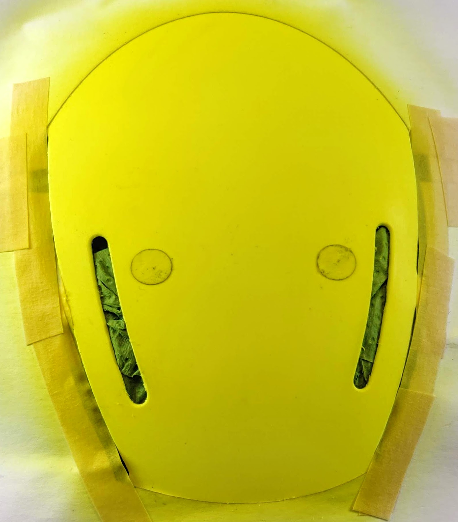
Once dry, masking comes off (apart from eye highlights) and we re-mask for the black layer, which includes all the facial features and the outline which encompasses four of the ventilation slots…
It’ll be interesting to see how it turns out. I’m toying with the idea of doing some sort of ‘differential topcoat’ with satin for most of it, but maybe gloss for the eyes? Not sure how that might work.
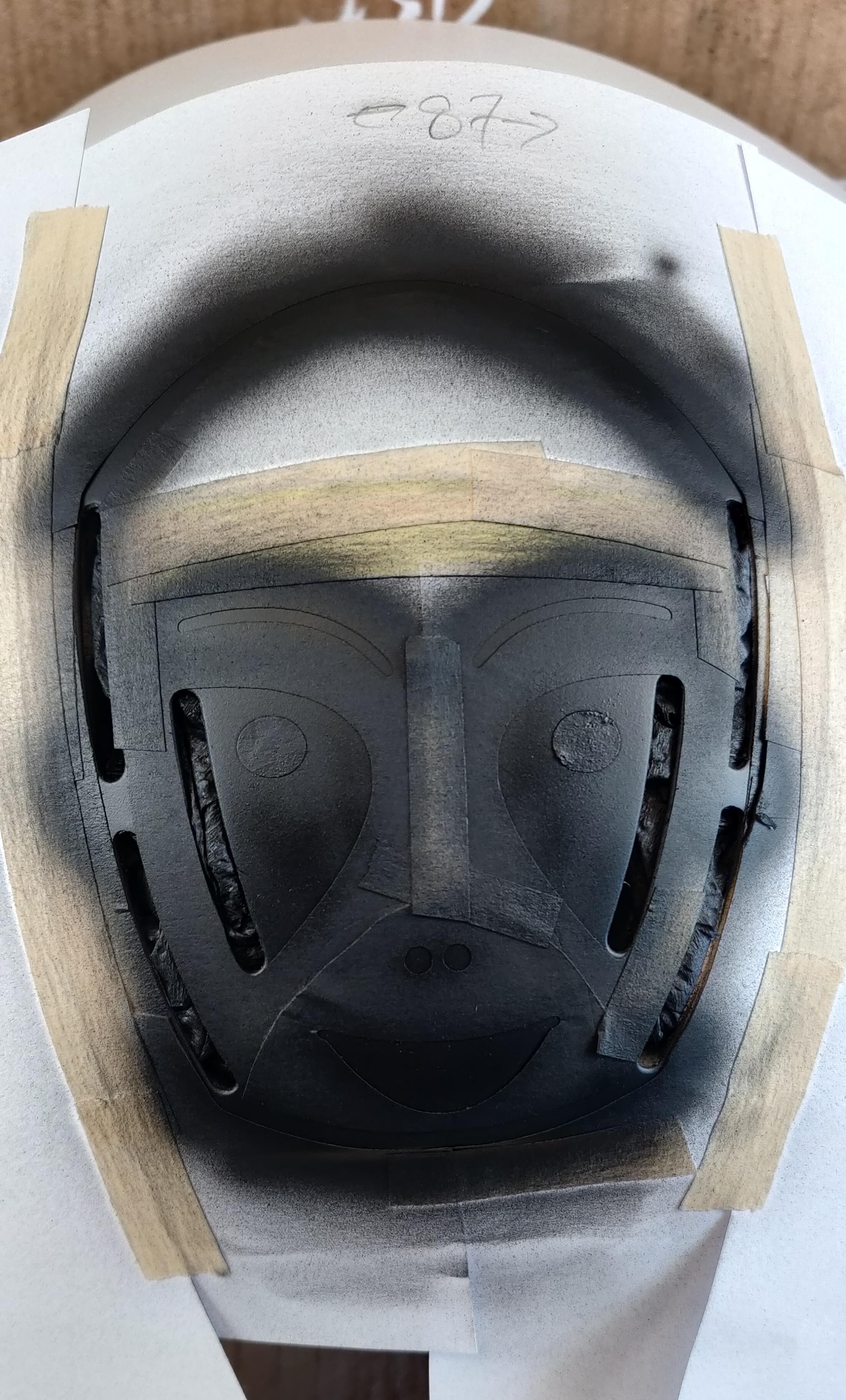
Once the 3 black layers were dry, the masking was peeled off and I tried it on with the mirrored visor…
I have to say I’m very pleased with that. It looks pretty much as I thought it would, only better. There’s very little stencil bleed. Have I finally hit on a good technique?
Below is an image of side by side design concept (left) and actual implementation (right). It’s pretty close. Although it looks as if the angle of the shot is slightly different.
What Next?
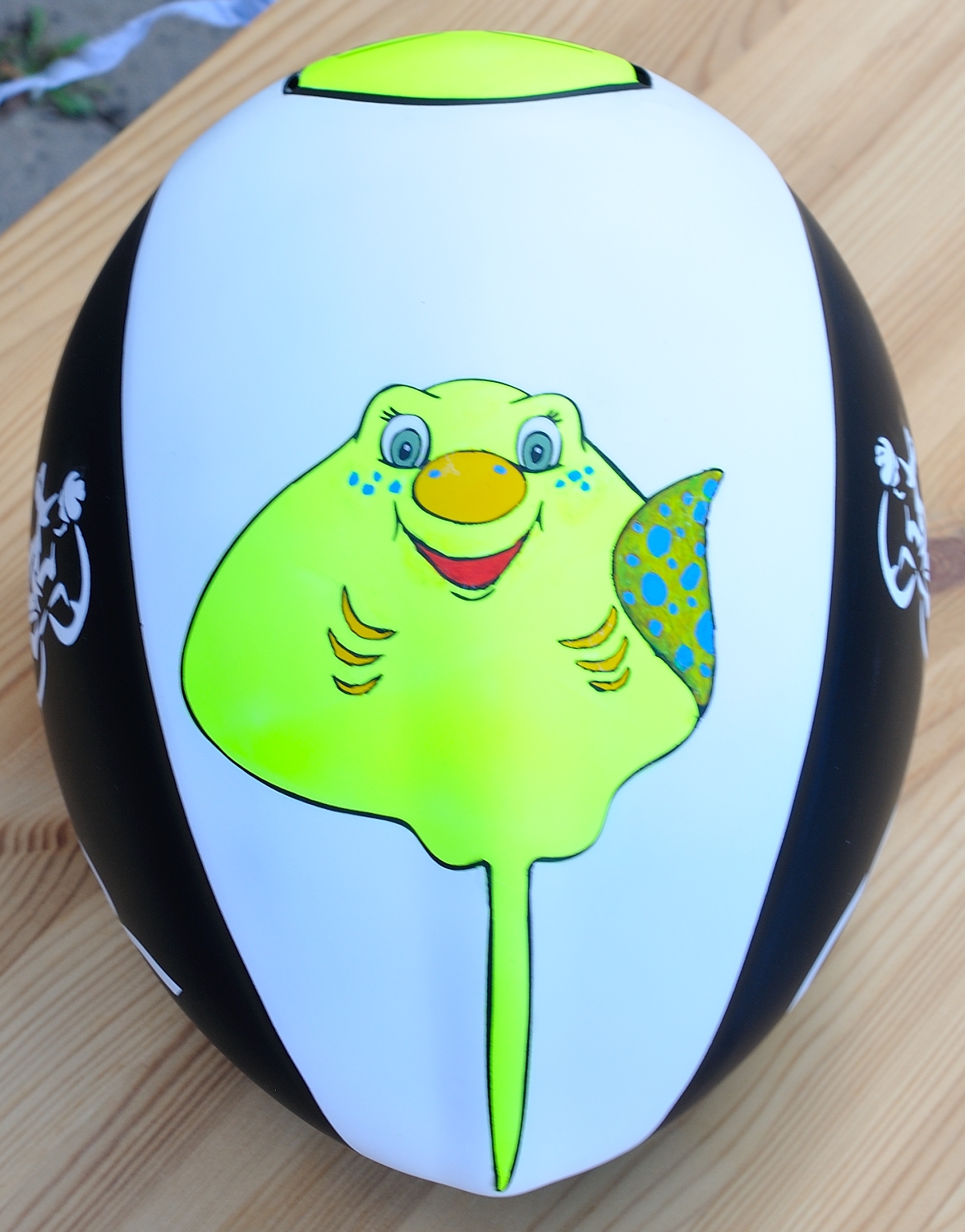
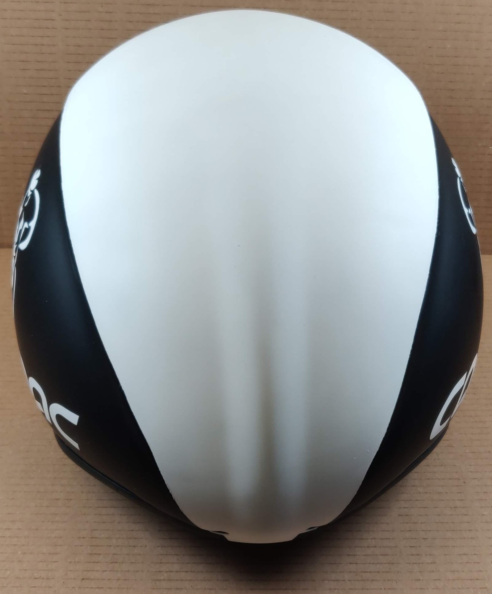
So when that’s all properly dried overnight, it’ll be time to protect it with a couple of clearcoat layers. There’s still a bit of space at the back, but I haven’t got a concept for that yet. There’s the awkward ‘tail’ shape to work around. Reminds me a bit of a lizard or crocodile tail with the spine running down it. Or even a cartoon stingray. But that’s an issue for another day…
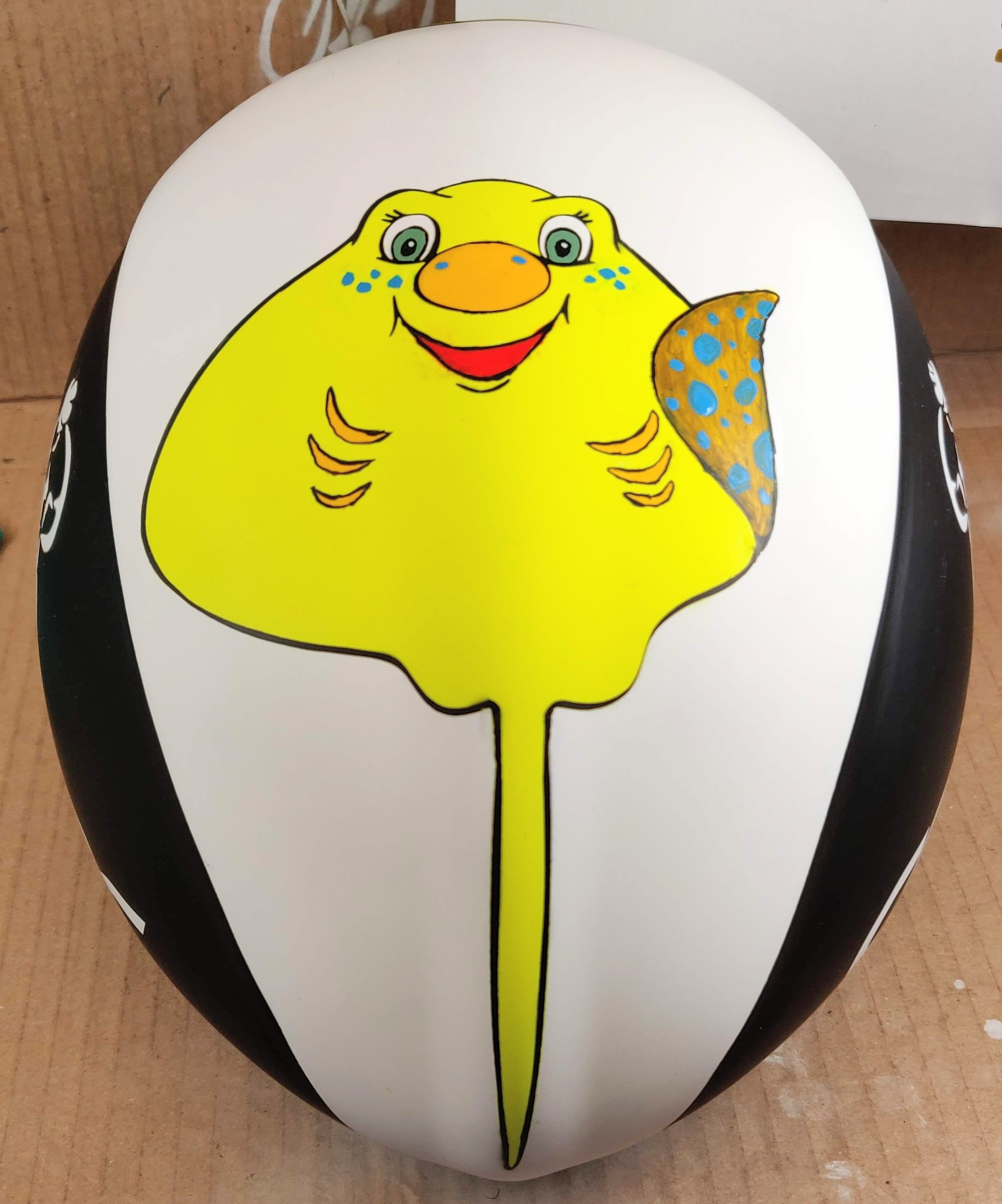
Cartoon Stingray it is then
After much prevarication and a few days off I ended up choosing the cartoon stingray I’d found on the first day. The graphic needed some tweaks to make it a good fit for the helmet. I straightened the tail and scaled it to fit.
I cut stencils in paper again and used 3M remount as before.
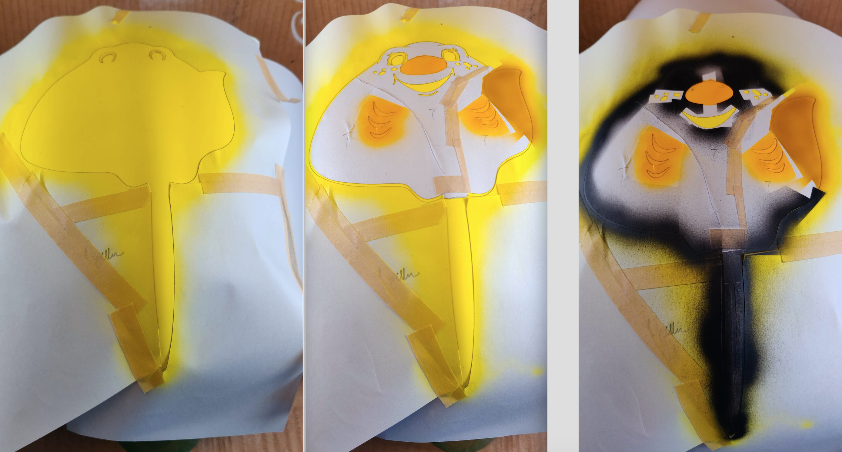
This design required several layers as there are several colours. It was quite complex and tricky, but the spraying side of it went quite well. Some of the detail was brushed, and some of that part went a lot less well. Filling in the green part of the eyes was fine, but the detailed fine lines around the gills and the “waving hand” are a bit wobbly for my liking.
Also, stencilling and brush-painting is a recipe for horrible bleeds. I had to scrub and redo the blue spotted area on the “waving hand”. Some of the fine lines around the mouth also needed some cleanup for this reason. These are things to learn from the exercise.
After spending most of the day on it, it finally looked like this…
Still needs a bit of tweaking and some clearcoats, so we’re not ‘there yet’. Another couple of days required to get to that point.